
The Performance Dashboard gives Loansure Admins complete visibility into the lead acquisition funnel — from the first impression all the way to a closed loan. Use it to track conversion rates and costs at every stage, model CPA improvements with built-in industry benchmarks, monitor daily call performance, and automate report delivery. Access it from the left navigation inside Loansure.
Accessing the Performance Dashboard
Select Performance Dashboard from the left navigation inside Loansure to open the dashboard. It is available to Admin users only.
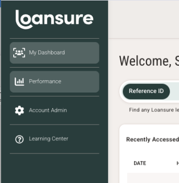
The Performance Dashboard includes four sections: Funnel Overview, CPA Simulator, Call Analytics, and Scheduled Reports.
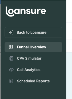
The Funnel Overview is your starting point. Select all program types or a specific program type using the filter at the top, then choose a reporting period — a preset week range or a custom date range. All three sections of the Funnel Overview update together.
End-to-End Funnel VelocityThe six tiles at the top of the Funnel Overview show your complete acquisition funnel in a single row. Each tile shows the volume at that stage and — where applicable — the conversion rate from the previous step.

The six tiles show every stage of your funnel from Impressions to Acquisitions. Percentages show the conversion rate from the previous stage.
- Impressions — Total impressions served during the reporting period.
- Unique Callers — The number of distinct callers who responded to your marketing.
- Answered — Calls answered by your team.
- Ref ID — Callers who were provided a Reference ID.
- Credit — Calls where a credit check was performed.
- Acquisitions — Closed loans, clients must provide Loansure this data for it to be populated. Talk to your Growth Manager about how to provide this data and get the most out of your Funnel reporting.
- Answered — Week-over-week answer rate.
- Ref ID Captured — Week-over-week rate of callers who received a Ref ID.
- Credit Check — Week-over-week credit check conversion rate.
- Acquisitions — Week-over-week acquisition rate.
- Total Calls — All inbound calls received, with the answered/missed split shown below.
- Answer Rate — Percentage of total calls that were answered.
- Avg Duration — Average length of answered calls. The target is 8+ minutes.
- Peak Hour — The hour with the most call volume, with the number of calls and any missed calls for that hour.
Below the velocity tiles, the Acquisition Funnel shows both volume and cost at each stage. The left column shows the number of leads at each step. The right column shows the cost per lead at that same step — so you can see exactly how much you are spending to reach each milestone.
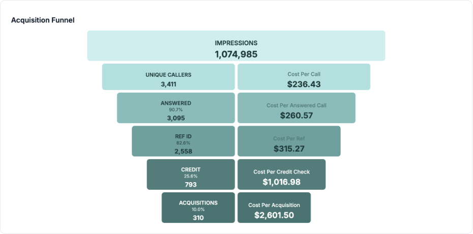
Each row of the Acquisition Funnel shows the volume and cost at that funnel stage
Funnel Performance Over Time
The chart at the bottom of the Funnel Overview tracks your four key conversion rates week-by-week across the reporting period. Toggle each line on or off using the legend at the top right.
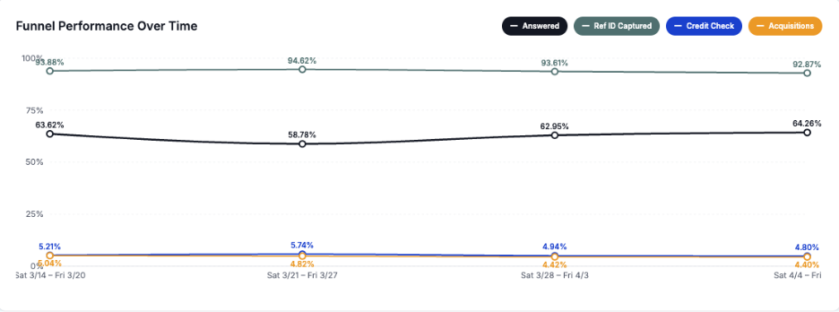
Each line represents one conversion rate tracked week by week. Use this chart to spot improving or declining trends before they affect your CPA.
CPA Simulator
The CPA Simulator lets you model how improving any part of your funnel would change your Cost Per Acquisition. It uses your actual performance data for the selected reporting period and compares it against industry benchmarks in real time.
Adjusting Funnel BenchmarksUse the four sliders to adjust each funnel conversion rate. The orange marker shows your current rate. The purple diamond shows the industry average for that metric. Drag the slider to model a different performance level.
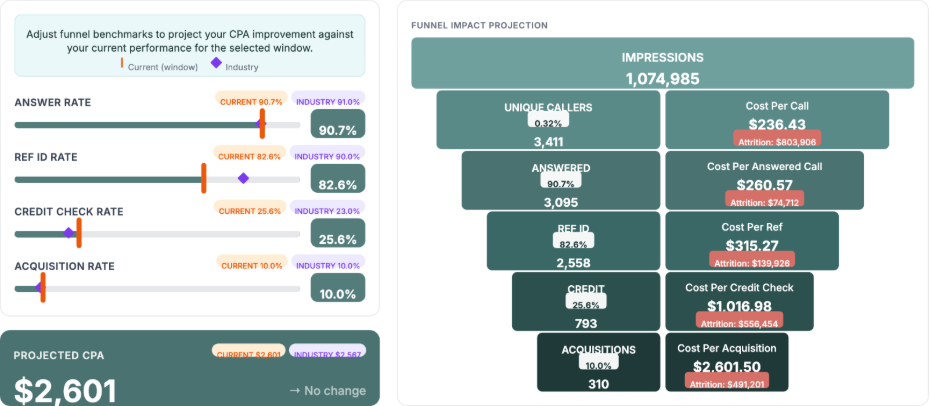
Adjust any slider to model a change to that funnel rate. The orange marker is your current rate; the purple diamond marks the industry average. The Projected CPA updates instantly at the bottom.
Funnel Impact ProjectionThe right side of the CPA Simulator shows how your slider adjustments change each stage of the funnel in real time. Volume and cost-per-stage update instantly as you move sliders.
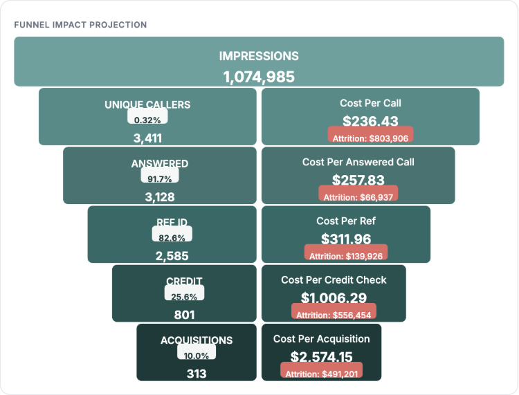
The Funnel Impact Projection mirrors your actual funnel and recalculates every cost-per-stage in real time as you adjust the sliders.
Tip: The Attrition labels in red show the total spend absorbed by leads who dropped off at that stage. A high Attrition value at the Credit stage, for example, signals a meaningful optimization opportunity.
Projected CPA & Outcome CardsAs you adjust sliders, three outcome cards update below the Projected CPA to show the business impact of the modeled change.
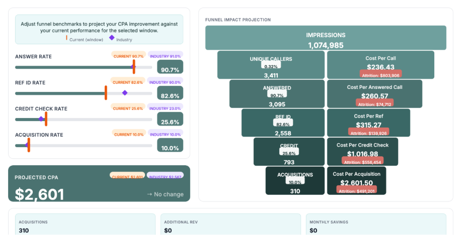
The Projected CPA shows your modeled CPA alongside your current and industry benchmarks. The three cards below show the projected number of additional acquisitions, additional revenue, and monthly ad spend savings.
Variable Impact RankingMove any slider and the Variable Impact Ranking section — powered by Loansure AI — activates automatically. It ranks all four funnel variables by their impact on your CPA, so you know which improvement to prioritize first.

Variable Impact Ranking is powered by Loansure AI. Move any slider to activate it. The ranking tells you which funnel improvement will have the greatest effect on your CPA for the selected time window.
Tip: Use the Reset sliders button at the top right of the CPA Simulator to return all sliders to your current actual performance at any time.
Call Analytics
The Call Analytics tab shows call performance for your program. Choose a time period — Previous Day, Previous Week (Sat–Fri), or a Custom Range — using the controls at the top. Select your time zone from the dropdown. Use Export PDF to download a report for the selected period.
Call Performance KPIsFour summary cards at the top of Call Analytics give you an at-a-glance view of yesterday's (or the selected period's) call performance.

The four KPI cards show total calls, answer rate, average call duration, and the peak call hour for the selected period.
Below the KPI cards, the hourly breakdown shows every active hour of the day as a horizontal bar chart. Dark green bars represent answered calls; red bars represent missed calls. The columns on the right show the total, answer percentage, and average duration for each hour.
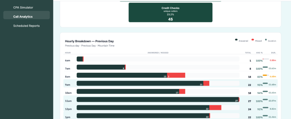
The hourly breakdown shows answered calls (dark green) and missed calls (red) for every active hour. Use this view to identify staffing gaps and peak coverage windows.
Tip: Hours with a red bar and a low answer percentage are your highest-priority staffing gaps. Every missed call represents a lead that already cost money to generate.
Scheduled Reports
The Scheduled Reports tab lets you set up automatic report delivery so your team receives performance data on a regular cadence — without anyone needing to log in and export manually.
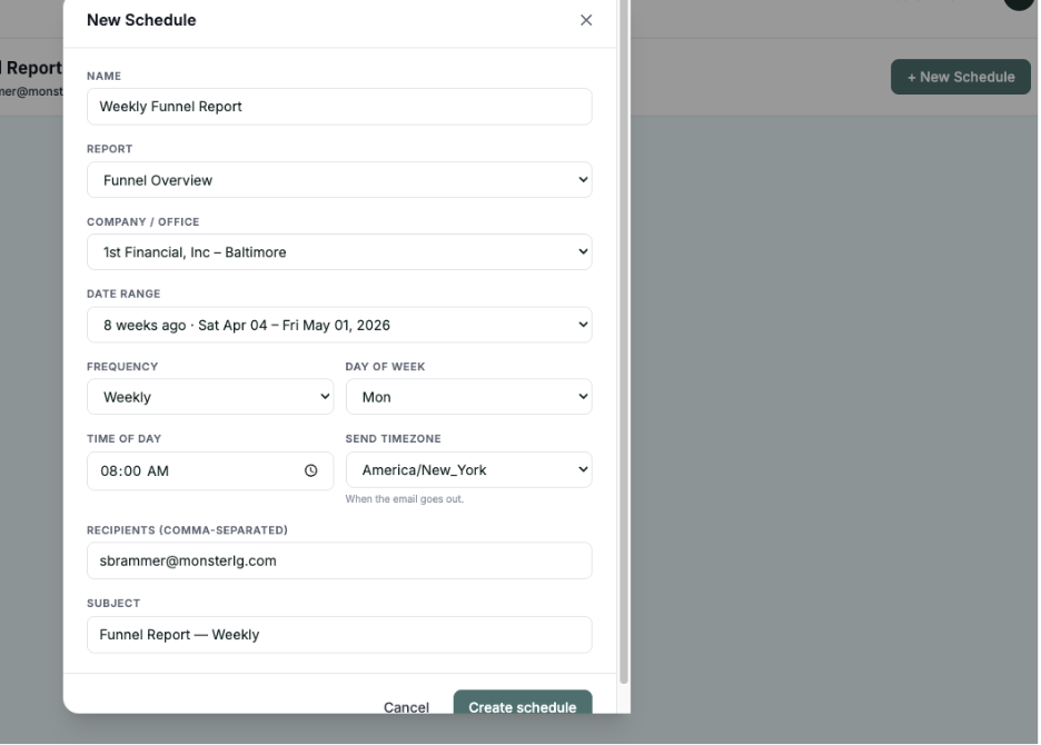
Select + New Schedule to create your first automated report. Scheduled reports are tied to your Admin account and run automatically on the cadence you configure.
- + New Schedule in the top right to create a new schedule.
- Configure the report type, recipients, and delivery frequency.
- Active schedules appear in the list and can be edited or deleted at any time.
- Reports are delivered as PDFs to the email addresses you specify.